


YouTube Video Player Redesign 2025: What’s New and Why Users Are Unhappy

Okay, YouTube lovers, have you noticed something different while watching your go-to videos lately? YouTube just dropped a totally new video player design, and it’s got a fresh vibe for the platform’s big 20th anniversary. But, plot twist: not everyone’s vibing with it. Let’s chat about what’s changed, why people are grumbling, and whether this new look is a hit or a miss.
YouTube’s old video player, the one we’ve all been using forever, just got a major glow-up. A Reddit user, @NoSpHieL, was one of the first to share screenshots of the new interface on the website, and it’s rolling out in phases—so if you haven’t seen it yet, it’s probably coming soon. This isn’t just a tiny tweak; it’s a full-on redesign to celebrate YouTube turning 20 (can you believe it’s been that long since the first video?).
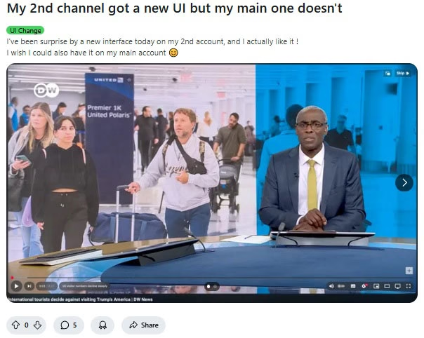
So, what’s different? The black gradient at the bottom of the video is gone, swapped out for these slick, pill-shaped buttons for stuff like Play/Pause, Next, Video Timestamp, and Chapters. The volume slider’s been moved to hang out with the other buttons, making everything look super clean. YouTube says this setup is easier to use, performs better, and makes tutorials pop by keeping controls out of the way. Honestly, it looks pretty sharp, like the video gets to be the star of the show.
Here’s where things get spicy: a lot of users are not feeling this update. X posts and Reddit threads are full of people venting about the new design. Some say the buttons feel crammed together and less user-friendly. Others are annoyed about the volume slider’s new spot, worried it’s harder to tweak the sound with their mouse wheel or keyboard (though we don’t know for sure until we see it in action). For tons of longtime fans, the old player was like a comfy pair of sneakers—simple, reliable, perfect. This new one? It’s like trading those sneakers for flashy dress shoes that look cool but pinch your toes.
That said, a few folks, like the Reddit user who posted the screenshots, are actually into it. They think it’s a fresh, modern take. But they’re definitely outnumbered by the critics who feel like YouTube went all-in on style and forgot about what makes the player easy to use.
YouTube’s trying to keep things exciting as it hits this huge 20-year milestone, and this redesign shows they’re not afraid to shake things up. But the pushback proves it’s tough to mess with something people love. The old player was familiar, and for a platform with millions of users, changing it is like rearranging someone’s living room without asking. Will YouTube take the comments into consideration and make changes, such as reducing the number of buttons or restoring certain outdated features? We’ll find out in time.
Have you had an opportunity to explore the recently released video player? Are you enamored with the sleek new look or do you secretly hope the original one will make a comeback? People are definitely talking about this update, so leave a comment below or join the conversation on social media! If you haven’t seen it yet, wait a little while longer; it will most likely appear on your screen soon.
YouTube is always changing, which keeps things fresh even though it may be a bit of a rollercoaster. Have fun watching as we explore where this revamp leads us!